Are you feeling claustrophobic in your home? Tiring of your shoebox-sized apartment? Is your home’s old-world charm no longer making up for its tiny living spaces? In New Orleans, a city full of historical homes dating hundreds of years, protecting the integrity of space is always a priority. However, in century-old home design, some rooms dwarf in comparison to their modern equivalents. Pint-sized bathrooms, cramped kitchens, and barely-there bedrooms force us to juggle historical integrity and modern needs for space. Before you start tearing down walls or browsing classified ads for a new housing situation, consider maximizing your space with paint! While painting your walls does not actually increase square footage, using the right shades and techniques can make your space appear bigger.
We are so happy to announce that Jason Bertoniere Painting was featured in this month’s Southern Home Magazine blog! In the article, Jason Bertoniere gives tips on how to approach your next paint project.
Everything you need to know from materials to prep to application plus all the do’s and don’ts before you tackle your next interior painting project are here on this article. Click the following link to read the full article:
A Professional’s Perspective: 5 Things You Need To Know Before Painting
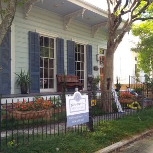
You heard it here first, neutrals are in! Studies show that houses painted grey are more likely to sell than their bolder-hued counterparts, and sell for over listing price. Color us intrigued! With Metropolitan AF-690, an elegant classic grey, recently named Benjamin Moore’s Color of the Year 2019, we know for sure, that grey is the color of 2019. With so many versatile shades of grey, it’s easy to stay within that color scheme–it goes with everything! But when your home is the fourth neutral in a row on your block, it’s time to spice things up and make your space stand out. Contrary to popular belief, you can use both neutrals and bold shades in the same space. Here are some of the best exterior accent colors and ways to incorporate them into your home exterior.
New Orleans celebrated its 300th birthday this year. In the city’s 300 years of history, several distinctive styles of architecture found their way into the Big Easy. Grand, off-white homes with undertones of grey evoke the beauty of French chateaus. Warm brickwork, broad porches, and towers nod to the British Queen Anne style of architecture. Rectangular, towered homes in shades of earth tones characterize the Italianate style. And crisp, true white, columned mansions speak to Green Revivalism. With century-old homes, care, expertise, and a very gentle touch help us preserve history. In a city built on a swamp that has survived hurricanes, floods, and dramatic temperature changes, historical preservationists work hard to combat the elements and preserve the character of historical homes.
Are you trying to decide whether you should take on that painting project you have been meaning to start for months, or whether you should hire professional painters? We understand! There are benefits to both. But as professional painters, and color specialists who have been working in the Greater New Orleans area for decades, we may be biased. In fact, one company took a poll and found that one out of every five people who paint on their own end up hiring a professional in the end. Here are 7 more surprising reasons why you should hire professional painters.
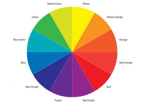
Bored of this seasons neutrals? You’re not alone. A study by a major paint company found that 58% of Americans want to switch out their neutrals for something bolder. While we love the classics and can always recommend a classy and beautiful off-white or beige, sometimes you need to spice things up. We love creating bright and beautiful spaces with vibrant colors. Adding a bold color to your walls can liven up a dull space and create something fresh and dynamic. These pops of color can elevate tired decor and allow your space to take on a distinct personality. Colors can evoke faraway places traveled and youthful carelessness. A lime green creates a childlike space. Bright red conveys drama and intensity in decor. Bright yellow invites warm and sunny feelings. And a bold black makes for a dramatic and sophisticated backdrop. However, a little goes a long way when you want to go bold. And knowing which colors will work with your space, lighting, and furnishings takes an expert eye. We have a few tips for how to brighten up a space and still keep it classy. Here’s your how-to-guide on bold interior colors.

Picture this: you’re sitting on America’s oldest operating streetcar, a national historical landmark. Deep green live oak trees line the street. Sunlight beams through their branches, creating intricate shadows on the streetcar tracks. And the houses. There is nothing more historic to Uptown New Orleans than the St. Charles Avenue mansions. A sea of elegant painted brick, sculpted columns, and cast iron fences, these expansive houses have become a tourist attraction of their own. The history of these famous homes spans centuries, and over time, they have developed a timeless, only in New Orleans look.
As color specialists, we often find ourselves looking for unique variations on the classics. A crisp, beautiful white dazzles in any space, but not all whites are created equal. We have talked about the top 5 Benjamin Moore whites in the past, and these shades are certainly popular for a reason; they’re beautiful and timeless. But when it comes to choosing the best color for your unique space, we want to ensure a perfect fit. When choosing a perfect white, undertone is critical. A warm undertone can make your space appear sunnier, while a cool undertone creates a more dusky, regal space. Here are a few of our favorite whites that break the status quo and deliver beautiful results.
Favorite Off-Whites
Over the past recent years, the go-to whites have been and still are OC-17 White Dove, OC-130 Cloud White, and OC-20 Decorators White. Truly 3 of our favorites! BUT if you are looking to venture outside these 3 beautiful whites, the list below will be your guiding compass for your next painting project. Enjoy!

Most of the high-gloss Fine Paints of Europe projects we have been a part of consisted of Fine Paints of Europe on the walls, ceiling, and trim with a monochromatic color scheme. This time, however, the homeowners of this fabulous New Orleans Lower Garden District home opted for something a little different.
Looking to put the “cherry on top” to their already beautifully decorated formal living and dining room, the homeowners combined our two favorite looks into one. As it turns out, brushed Satin Impervo oil and Fine Paints of Europe high-gloss create an exquisite, sophisticated duo.


Posted in Blog | Comments (0)